
I like the White Ops uniforms that we used at West Virginia on Saturday. I think Under Armour does a good job for Maryland.
I also love the football Pride uniforms. Those uniforms give us an identity. 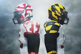
We had an identity with the Terps logos on both our white helmets (recently) and the red helmets from the 80’s. That was a winning identity and the world knew who we were. 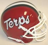
Our athletic director, Kevin Anderson came on board and wanted to adjust the University’s brand. Terps needed to go and MARYLAND was the brand. I am not sure who got the job to remake the image and who selected the odd font that MARYLAND is presented. It has not been well received by the general fan base.
Hey, I don’t run the athletic department so if you want to re-brand, go ahead.
As “Wayne the Fan”, I know what I want to see and that is the white Terps script on the red helmet. These are the Maryland TERPS. Not MARYLAND. But if that is what the department wants, MARYLAND in a funky font that looks like it came from a rest stop on route 95. then so be it.

Here is where I have an issue. The Athletic Department wants an identity. It wants an identity so badly that it throws out TERPS and switches to MARYLAND. And Then… we change the uniforms every week.
When you watch Terp football, you don’t know what you are going to see as far as uniforms. If you don’t watch on a regular basis and you see a highlight, you don’t even know it is Maryland.
Case in point, we finally get back on national tv, alibi buried on DirecTV 248, we break out new uniforms. Although beautiful, artful and subtle, they don’t look like us. Where is the identity?
We dumped TERPS to build an identity and then come up with a uniform concept that skews our identity to make us nearly unrecognizable to the average fan. I think that this confuses the fan at which the new identity was aimed.
So what do I think the die-hard fan-base wants? How about a throw-back to the 80’s look? We had all the colors, red, black, gold and white along with the red helmets. Maybe just give that a spin for homecoming. At least you would know it is the Maryland Terps who are on the field without picking up a copy of GQ.
I like the new uniforms. But, I agree with you. Different uniforms every game? I think you are right. Gray is not a university of maryland color. The uniforms sure do look good! Maybe to good.
Anyway I did enjoy the game even though we lost.